How Your Business Name Affects Your Logo!

How your business can benifit running off G Suite by Google
May 15, 2018
How Dubsado got me to stop being cheap with my business.
February 25, 2019Let's talk logos...shall we?
There are many, many, many logotypes and technical jargon to describe them. I am only going to cover the basic 2. So, I am making a promise to you (and myself) to keep this post as basic and lamen as possible. So here goes...
"What's in a name?"
One of the primary factors in your logos visual layout tend to be the business/product/service name. You will notice that companies whose logos spell out their name tend to be short. A single or double syllable word business will utilize the full name within the logo itself (Pepsi, Google, Facebook, etc.). 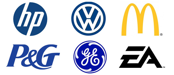 Letter LogosYou will also notice that companies whose names are somewhat longer tend use acronyms or single letters as the primary or sole visual representation
(McDonalds, Vokswagon, Home Box Office, Electronic Arts, etc.)
"A new business just might need to "spell it out"."
For now, we will narrow down the options to 2 types, "word logos" and "letter logos". Cool? So where does your company fit on the spectrum?  Crisis Management Global (letter logo)Well, if you were my client "Crisis Management Global" I'd say, "Letter logo! For the love of God! Letter Logo!".
. A three word, 7 syllable business name almost always will have no other option. But let's say your product name is "Macintosh" (I wish) and you want me to do your logo. The length of the name falls in that proverbial grey area in which you can kinda' go either way. In fact, that is what Apple did. The computers of olden had the name written in full. Once the brand was established all we know is "Mac... Mackbook, iMac, Mac this, Mac that." That is the power of branding at work. Remember your name can evolve. As a new business, choosing a name that can exist as a "word logo" might be the right move. Again, if it is not too long!
The clever approach
Another factor to consider is the distinction of your name. Is it creative, clever, or funny? If so, a word logo is advantageous, you want people to see that name to utilize its attention-grabbing quality.  Squatty Potty (word logo)Like the new company that premiered on the TV show, Shark Tank, that sells a footstool to assist you in making number 2's in the bathroom. They came up with the oh-so, perfect name "Squatty Potty".
It's funny, to the point, and descriptive. Sometimes sh*t just comes together (see what I did there?). Do not stress yourself trying to achieve a clever solution. Sometimes it simply doesn't fit.
"Ease Of Reproduction"
In all my years as a graphic designer, I can count on one hand the clients took into account reproduction. What this means is when you have a logo and you want to put that logo on something; fabric, wood, metal, led lights, etc. You need your logo to transfer easily and without destroying the integrity of said logo. Complex logos mean complex processes which means more money. In most cases, letter and word logos are a safe bet for reproduction but you might want to consider how your 20-word company name is going to fit on a shirt pocket should you chose to get your logo embroidered.
